


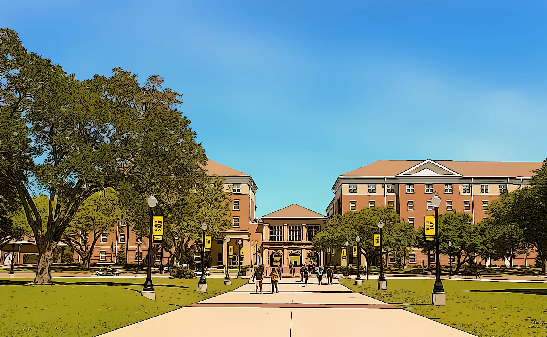
Making the Bay Area cleaner with UX design
Client:
GRID Alternatives
My role:
UX research, UX strategy, business strategy, client management, principle UX design for grant application process
Duration:
3 week design sprint from August 6th, 2019 - August 23rd, 2019
Team:
Ilya Benjamin, UX Designer, Robert Charnley, UX Designer
Opportunity
Applying for a grant to upgrade a car is a pain.
Clean Cars for all is a program that focuses on providing money to income-eligible California drivers to retire their older, high-polluting car and replace it with a zero- or near-zero emission replacement. GRID Alternatives case managers are the bridge between Bay Area constituents and clean government resources. In addition to the great things that they do for San Francisco, its people, and environment, they assist a growing number of grant applicants that have issues in the grant application process. Our UX team teamed up with GRID Alternatives to enhance the grant application experience and help them scale a growing program.
Our main challenge was to reduce usability issues in the grant application process and improve the conversion rates from applicant to grantee by staying within the technical constraints of the BAAQMD design system and the Fluxx.io out-of-the-box features.
Approach
How do we design within the constraints and make multiple organizations happy?
When we received our project, it was necessary to understand how our client, GRID Alternatives, fit within the larger context of the clean air grant landscape. We learned that GRID was a subsidiary partner to the Bay Area Air Quality Management District (BAAQMD) and GRID didn’t own the digital products used in the grant process. To be successful on this project, we needed to understand the grant landscape and who the stakeholders were, what were the system constraints and limitations, and who were the target users and their experience.
Several considerations existed for this project:
Our client was GRID Alternatives, however the grant application portal is hosted by the Bay Area Air Quality Management District, who provides the technical infrastructure and is the primary funder of the program
Bay Area Air Quality Management District contracts with a 3rd party vendor, Fluxx.io, to provide grant management support
GRID Alternatives provides project/case management for the program.
Constraints:
We had to maintain consistency with the design system of the Clean Cars for All program site
The 3rd party grant application software, Fluxx, had many limitations in their out-of-the-box software
Problem
“I don’t have the time or effort to complete this tedious application”
Users were apprehensive to complete the grant process due to the form’s unapproachable language, unclear communication of eligibility and what the grant process asked for, and inconsistent standards in the grant form. Due to these friction points, the grant experience was arduous, disconnected, and complicated.
Solution
Designing a welcoming grant application experience
Create a unified experience
Our team redesigned all unapproachable content between Clean Cars for All website and Fluxx.io portal. Landing page in the Fluxx application portal is one that teaches the user how to use the Fluxx portal.
Clarify ambiguous expectations and Fluxx features
Clearly state what the applicant will need to complete the grant process.
Improve learnability and trust with a new form flow
Simplify the form flow to improve trust, learnability, and to funnel qualified applicants through the grant process.

Research
The grant application process is inconsistent, unapproachable, and difficult to complete
A usability test of the Fluxx.io grant application system and the point where users experienced a critical error leading to abandonment
Contextual Inquiry & User Interviews
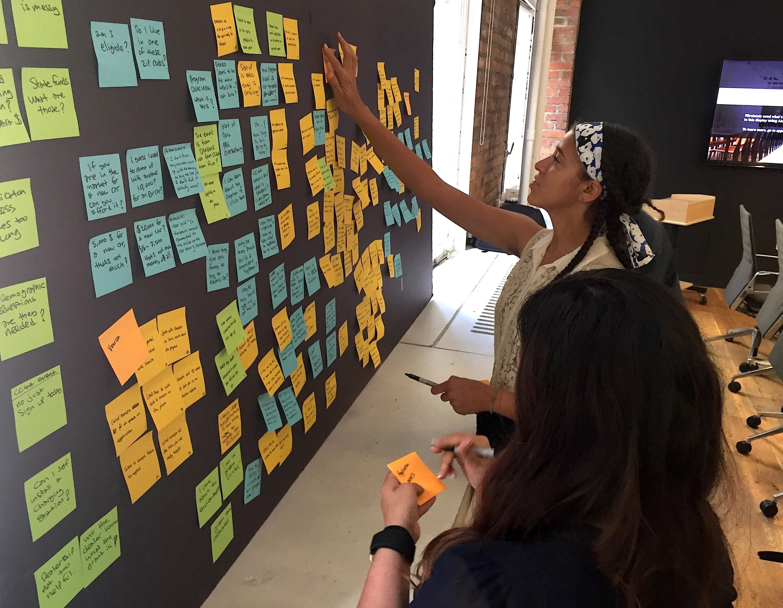
Completing the Clean Cars for All grant application is mostly completed on a desktop device. We spent the majority of our first week and a half getting to know the grantees of the program and GRID Alternatives case managers. We asked a lot of questions, attended an Oakland Clean Cars for All event, and began to collect information into post-its for eventual affinity mapping.
Usability studies
We created a research plan, conducted two remote usability tests, and a third usability test in person. We tested understandability of the Clean Cars for All website versus two similar websites, we tested three additional goals in the Clean Cars for All website, and conducted usability testing of the Clean Cars for All application in Fluxx.io.
Key observations
The Clean Cars for All website is an easy site to navigate, however it was difficult for users to quickly understand if they were eligible for the grant and what to expect in the grant application process.
The third party grant system, Fluxx.io, had significant usability issues, with 100% of testers having non-critical issues, and 33% of testers abandoning the application altogether.
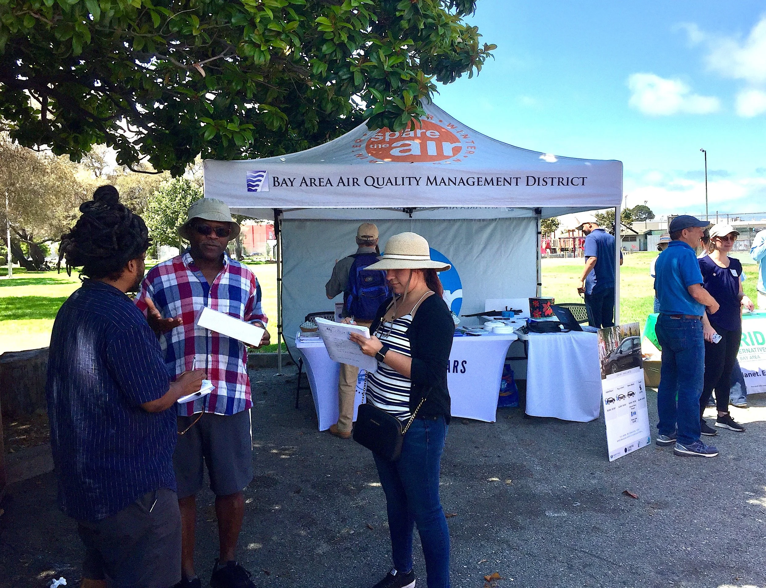
Our design team attended the Oakland Clean Cars for All event and conducted interviews with grantees that have completed the grant process and upgraded their vehicle to an eco-friendly vehicle
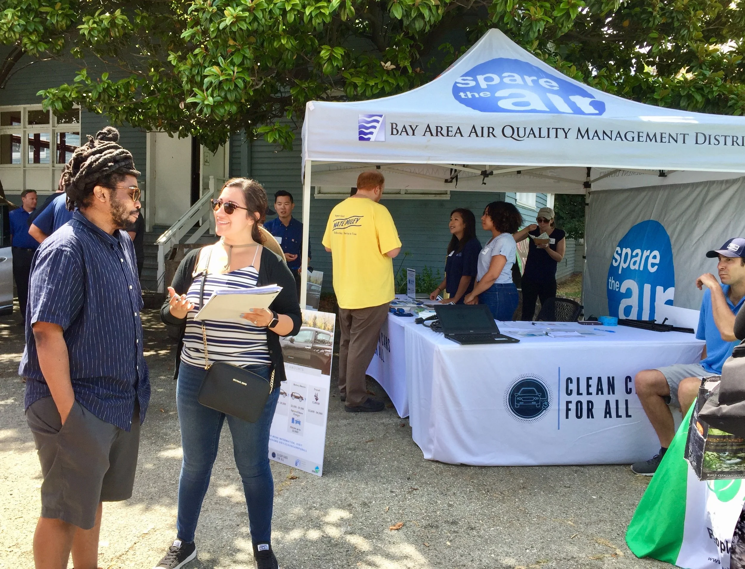
Our team conducted contextual inquiry at the Oakland Clean Cars for All community event

Our team mapped the user flow and journey to refine our understanding and determine next steps for synthesis
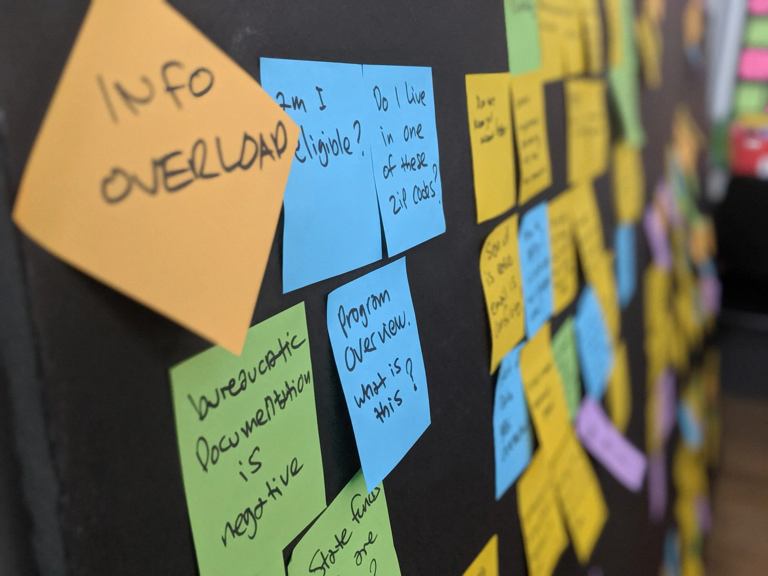
Our Findings
A lesson in what makes us human
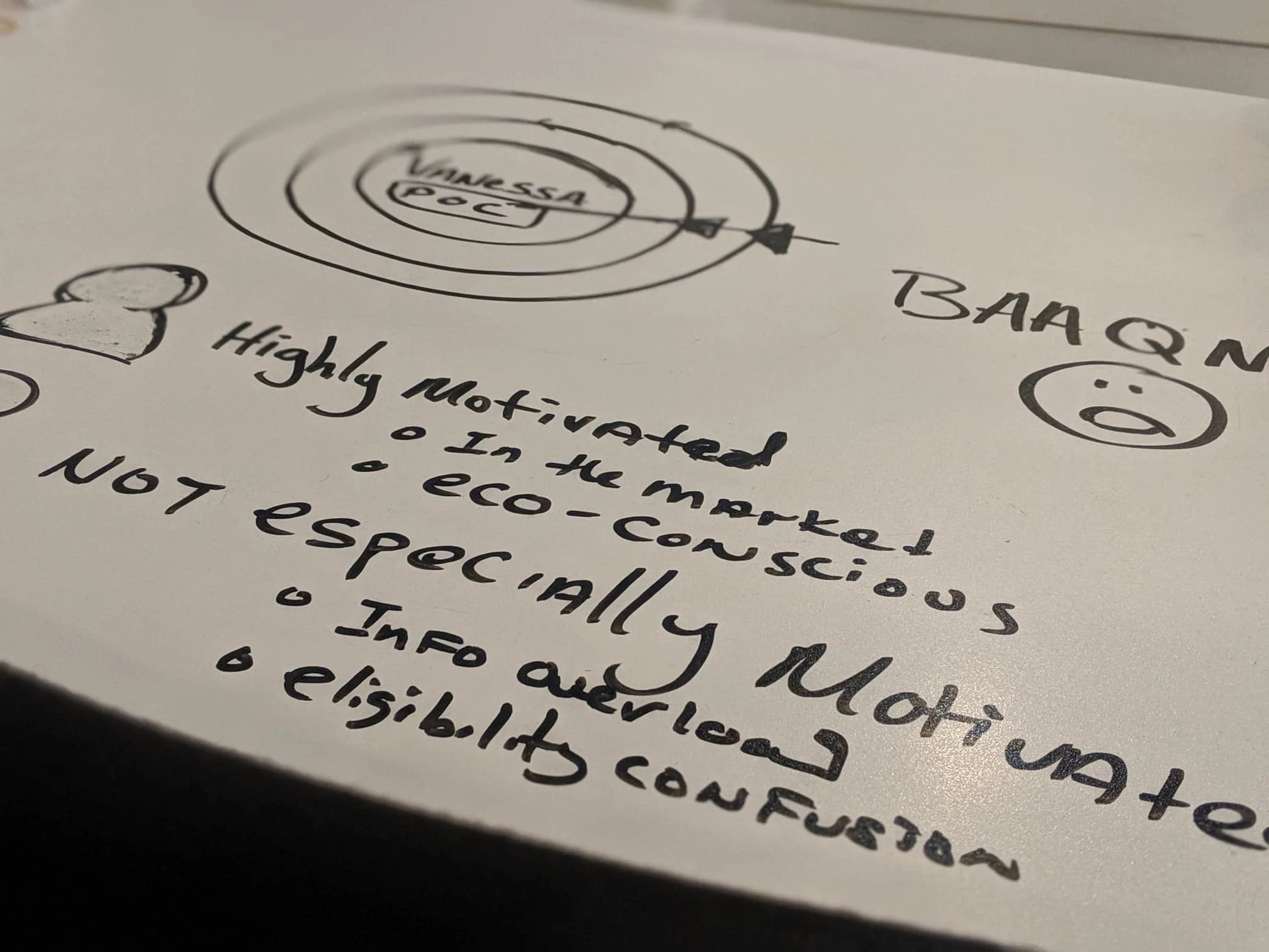
We invited our clients, GRID Alternatives, to join our team in a co-design session. In that session, our clients and our team completed an affinity map, empathy map, and journey map. From that meeting, we got a much deeper picture of our target user and began to deeply empathize with them. A memorable quote from our empathy mapping was:
“My mother was diagnosed with cancer and I have to drive her to chemo.”
This quote became our north star and guided the creation of our archetype user. Our archetype user, the Discouraged Decider, was someone who:
Is time-constrained
In need of a vehicle upgrade for security and reliability
Needs support with involved applications
Listens to the TV and radio
Is Goal-directed
Needs high return on investment on new activities
The result of our meeting was a convergence of information that helped us identify the key pain points that would be the basis of our problem and hypothesis.
Our client-partner, Vanessa, affinity mapping alongside our team

Our co-designed empathy map
A synthesis of our two target users

Design
Making the Clean Cars for All application a friendlier and approachable experience
Eliminate unnecessary steps, make language approachable, give the user all opportunities to succeed in the grant process
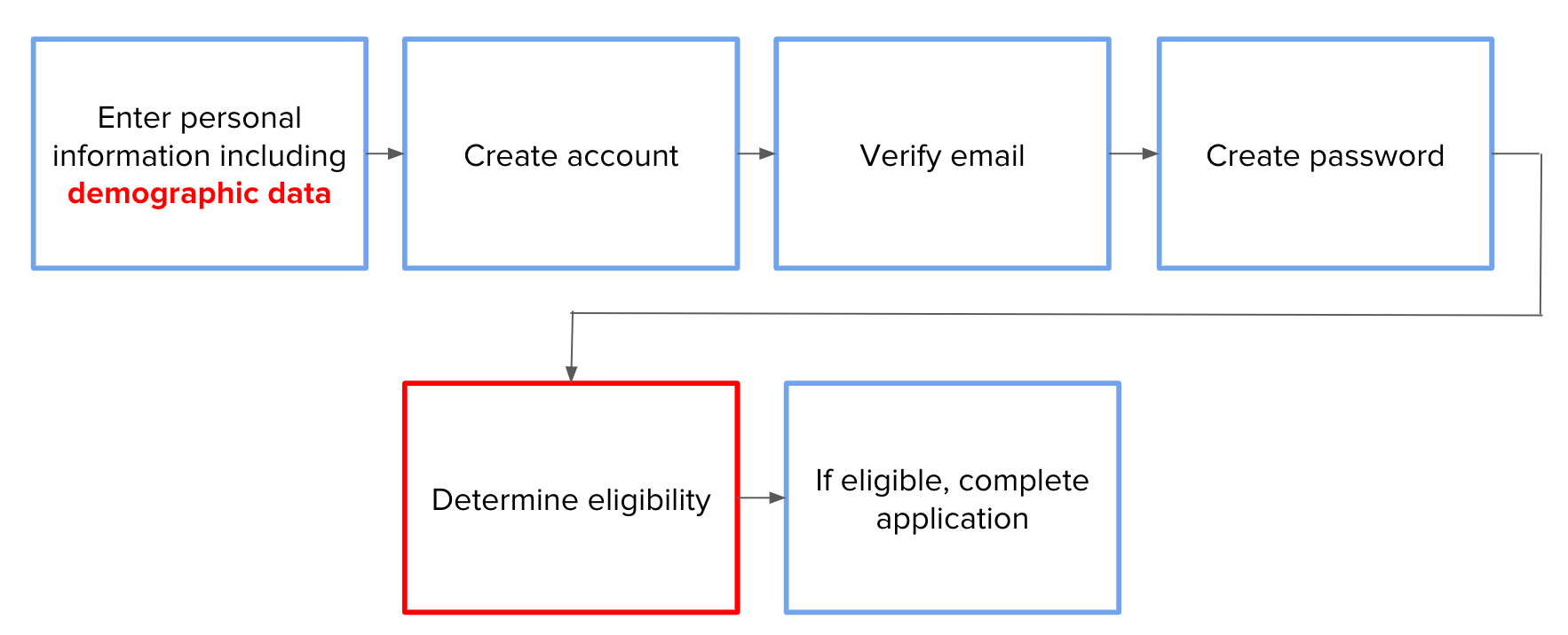
The current grant application process. Friction points are denoted in red.
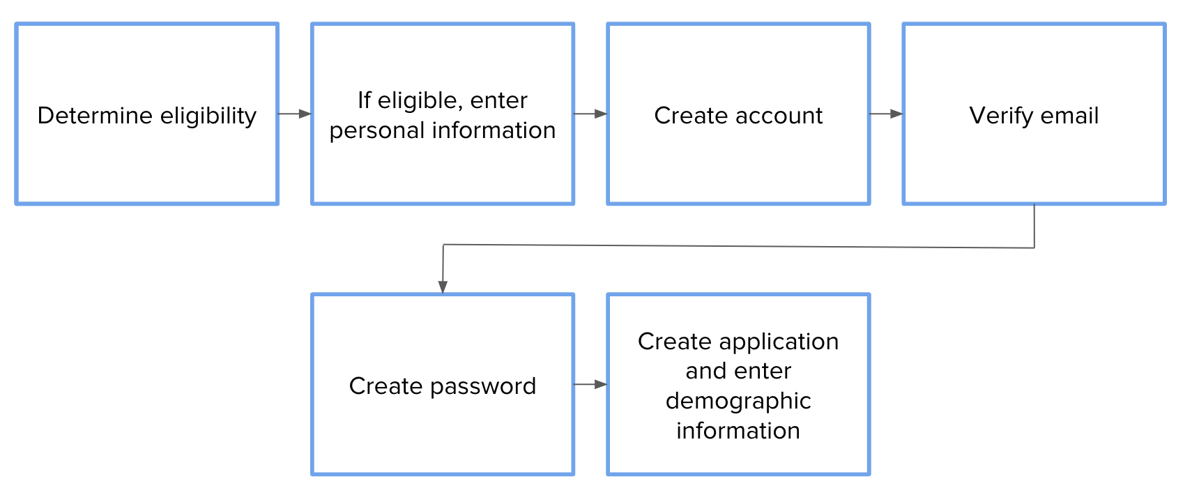
Our proposed grant application process addresses pain points and removes friction.
Pragmatic form design and UX writing
We front-loaded the grant application form so users can confirm their eligibility at the beginning of the grant application process, instead of needing to complete five separate actions before confirming eligibility. We redesigned the landing page experience to so that the user feels welcomed and is taught how to use the Fluxx.io application. We also introduced images to several of the application pages so users knew how to complete the application, knew what to expect, and had the resources available to receive help.
Revising the existing form flow was an excellent immediate solution. A well-researched and well-tested form laid the groundwork for our long-term solution: scaling the application for a growing population of applicants. By re-designing the Fluxx application, we were able to work around limitations that the Fluxx.io third party vendor presented.
Key improvements
Simplified flow so the user could quickly confirm their eligibility
Improved experience for users looking to understand what to expect
Reduction of all critical errors by 100% with the introduction of
Reduction of non-critical errors by 60%
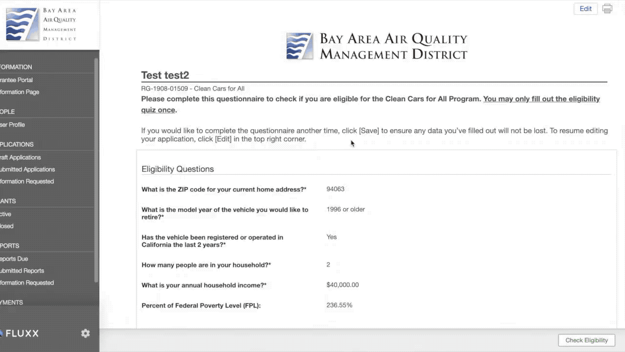
Confirming eligibility first
Users are greeted with language that confirms they are in the Clean Cars for All Fluxx 3rd party grant system.
Principles used:
Be concise
Begin with the objective
Make the copy consistent
Write in the active voice

Welcoming and approachable language upon confirmation
Using UX writing and matching language between the system and the real world, we introduced more colloquial language and made it apparent within the Fluxx.io’s system settings to let the user know if they are eligible or not.
We also removed demographic questions because it caused unease and distrust when asked so early in the application.
Principles used:
Make the state of eligibility clear
Match language used in the system with the real world
Write in the active voice
Arrange form fields from easiest to hardest

Avoiding phishy emails and lessening distrust
Once a user creates an account, they are then asked to confirm their account via an email that is autogenerated from the Fluxx.io grant application system. The previous version of the email language resulted in 100% of usability testers being uneasy in clicking the link because the email looked like it was a phishing email. We redesigned the email language to be approachable, remind the user about what they are doing, and providing cues that this email is part of the grant process.
Principles used:
Design for trust
Recognition rather than recall
Demystify language by removing acronyms and writing out the full words
Match language used in the system with the real world

Removing barriers by creating a user guide
When users confirmed their application via email, they were dropped on a page that was extremely content heavy with non-accessible 14px font size. 100% of users who tested this page commented that it was too much information, not legible, and not useful. Due to restrictions in the Fluxx portal regarding how content can be displayed, we created a user manual that was rendered in the portal as separate images. We also created alt text to be compliant with WCAG 2.0 accessibility guidelines.
Principles used:
Heavy usage of imagery
Legible and accessible text
Friendly and understandable language
Conform to the brand guidelines
Focus on the task
Be specific

Making the application portal the go-to place for all information needed by the applicant
The Clean Cars for All application portal had limited information about the grant process. We heard from users that because the grant process takes a couple of months, that it was more efficient for them to call the GRID case managers than searching around on the Clean Cars for All website and application. To improve the scalability of this program and to reduce the need to call GRID case managers, we created additional content regarding what to expect throughout the entire process.
Principles used:
Heavy usage of imagery
Legible and accessible text
Friendly and understandable language
Conform to the brand guidelines
Provide useful links found on the FAQ section of the Clean Cars for All website
Draw the eye with colorful content blocks and a timeline of grant activities

Working within the constraints to serve the Bay Area
We spent a few hours looking through the Fluxx.io community support website to understand the opportunities and limitations of this 3rd party system. From our understanding, we could change button colors, add additional form fields, and insert images. We used these opportunities to make buttons more visible and consistent with the Clean Cars for All brand. We used the same principles from the user guide Fluxx portal page and created image snippets that explained how to edit, save, and submit the application. We also made the document buttons more discoverable by changing the buttons from an outlined button that offered medium emphasis to a contained button for higher emphasis as they use a color fill and shadow. While hierarchy and placement were limitations, we did find the discoverability of the document upload buttons increased by 70%.
Principles used:
Stack form question and form field on top of each other instead of side by side
Buttons should be easy to find among other elements, including other buttons.
Buttons action and state should be clear
Text fields should stand out and indicate that users can input information.
Text field states should be clearly differentiated from one another.
Text fields should make it easy to understand the requested information and to address any errors.

"We are incredibly impressed. We are going to change the way we work with our clients"
This design project culminated with overwhelmingly positive feedback from our client, GRID Alternatives. They were excited to receive recommendations that could be implemented immediately, and were delighted at the creativity we demonstrated to work around the limitations of the grant system. They also appreciated our engagement with their partnering organization, BAAQMD, and expressed appreciation with being involved in a project that affected them directly.
What’s next?
We looked at the bigger picture and understood that the major limitation in implementing changes was insufficient funds for BAAQMD’s software engineers. As part of our recommendation, we recommended a partnership with the Code for San Francisco non-profit civic-hacking organization. With Code for San Francisco’s help, we recommended that the following changes be implemented:
Implement changes to the content to improve engagement and satisfaction from target users
Introduce imagery and more iconography to improve satisfaction and learnability of the program
Implement new flow for the Fluxx portal to reduce burden and effort of learning eligibility
Pair modifications we made with a robust email campaign
Key takeaways
When in doubt, communicate with the client
We hit a few obstacles when it came to understanding our users and the grant application process during the first week of our sprint. Due to the intricacy of the organizations behind the Clean Cars for All grant, we were running in circles and going too deep in the weeds in trying to understand the problem landscape by ourselves. We course-corrected as soon as we involved our clients in the conversation. We gave them room to teach us about what they know best, their business process, the landscape, and their clients. Once we increased communication frequency, we were able to move speedily through the UX process.
Testing early and often
We were, at first, unsure how to test the grant application. It required account creation, email verification, and uploading of personal data. In week two, we finally tested doing the application ourselves and found a few resources that allowed us to conduct baseline usability testing. With grit and persistence, we were able to have three usability testers show us the pain points in the application system.

Reimagining the University AI Assistant
The project
This was an entrepreneurial idea that was iterated across four courses within a team-based graduate school setting. The four courses that developed the context for this project were:
• Software Product Definition
• Requirements Analysis
• Software Product Strategy
• Software Economics
When/Where:
Carnegie Mellon University, Masters of Software Management
October 2018 - May 2019
Team
Karl Enguerra, Apple Engineer
Junhan Chen, Language Technologies Engineer for Siri at Apple
Shreya Rawal, Senior Technical Consultant at ServiceRocket
Sid Ramesh, Data Scientist at Microsoft
My contributions
User interviews, customer segmentation, market analysis, business model canvas, requirements analysis, competitive analysis, value proposition, technical architecture, marketing strategy, software economics, presentations, storytelling
The higher education space is underserved
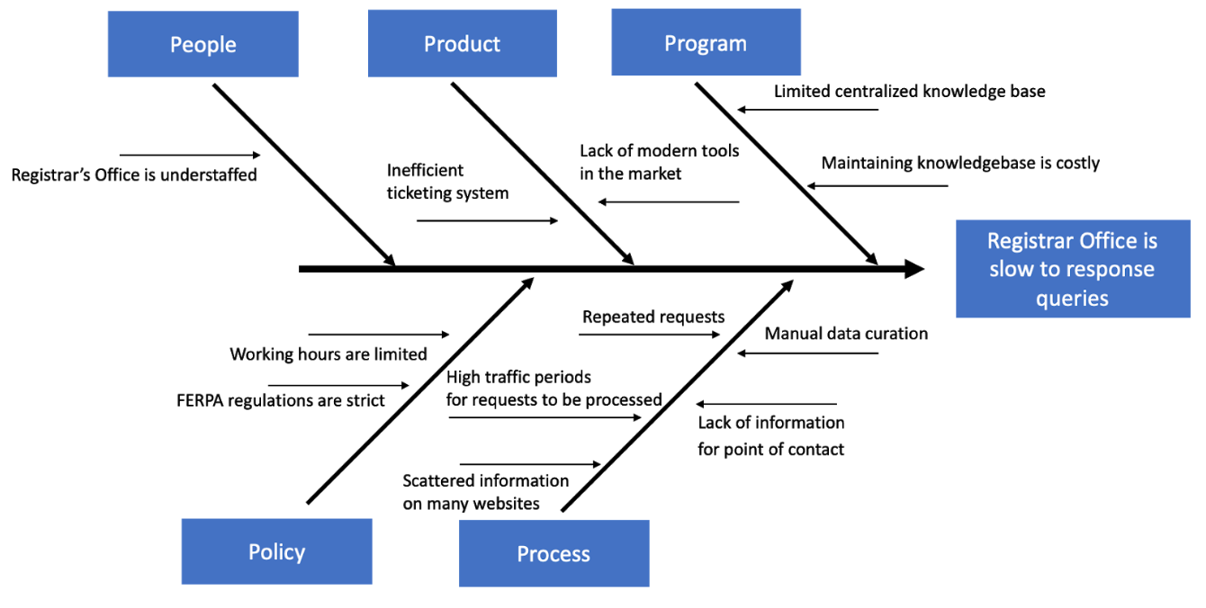
The Registrar’s Office plays a critical role in the operations of universities in the United States. It manages and distributes information to people across the university, for a typical week in a Registrar Office with 4 staff members in a medium size university:
80-150 messages and tickets from all over campus
Toward beginning of quarter, additional 50-150 emails / tickets regarding course & schedule, 50-150 emails regarding grad admission, per day
Toward end the of the quarter 100-200 messages regarding degree progress for graduation
Most of these requests are repetitive. As a result, students, faculty and staff have to wait days to weeks for a response from the Registrar’s Office because of the use of manual solutions and inefficient tools.
AIUR’s differentiator is that it offers deep specialization in university data
There has been a boost in machine learning, deep learning, and natural language processing (NLP) based solutions in education. The education-based AI market is projected to grow from $537.3 million in 2018 to an expected $3.6 billion by 2023, indicating that stakeholders in the education space are increasingly becoming more open to mining and monetizing big data.
Despite the growing opportunities, an AI-powered intelligent assistant targeted towards the education industry is uncommon. While many of the current players have unique advantages, there is currently no “de facto education registrar assistant”, while other products are either service-based companies which do not specifically target Registrar Offices, or are other companies mainly focused on sales and marketing.
AIUR, therefore, will focus on differentiation by increasing customer willingness to pay relative to rival’s offerings with the deep specialization in understanding university data and the ability to extract immediate value with that data through our AI-powered platform.
AIUR’s edge will principally be vertical, outperforming rivals’ products on dimensions for which customers would agree that “improved understanding of the higher education space is better.”
What are our hypotheses about taking AIUR to market?
Hypothesis 1
We believe that if AIUR is successful in its ability to understand university data, then AIUR will enable universities to save money by its ability to provide answers to frequently asked and redundant queries. This in turn will free up the Registrar's Office Staff hours allowing them to work on non-repetitive tasks instead of needing to increase their resources to address increasing demand.

Hypothesis 2
If AIUR is able to access university data at any time, then AIUR will significantly lessen the response time due to a 24x7 availability to populate answers with an AI-powered search for frequently asked questions.

Hypothesis 3
If AIUR is accurately priced, then AIUR will be priced based on student population size.

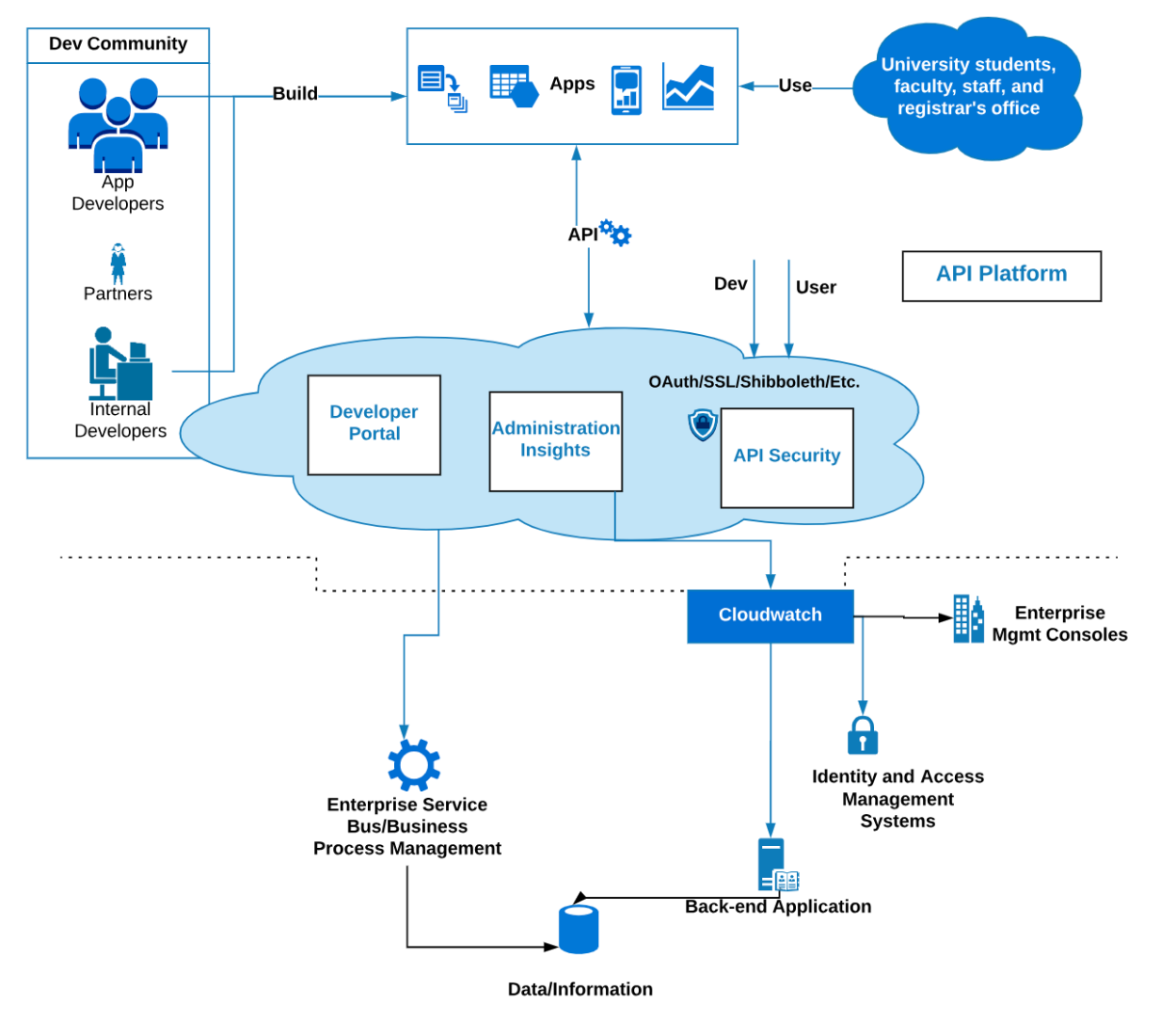
What does AIUR look like under the hood?
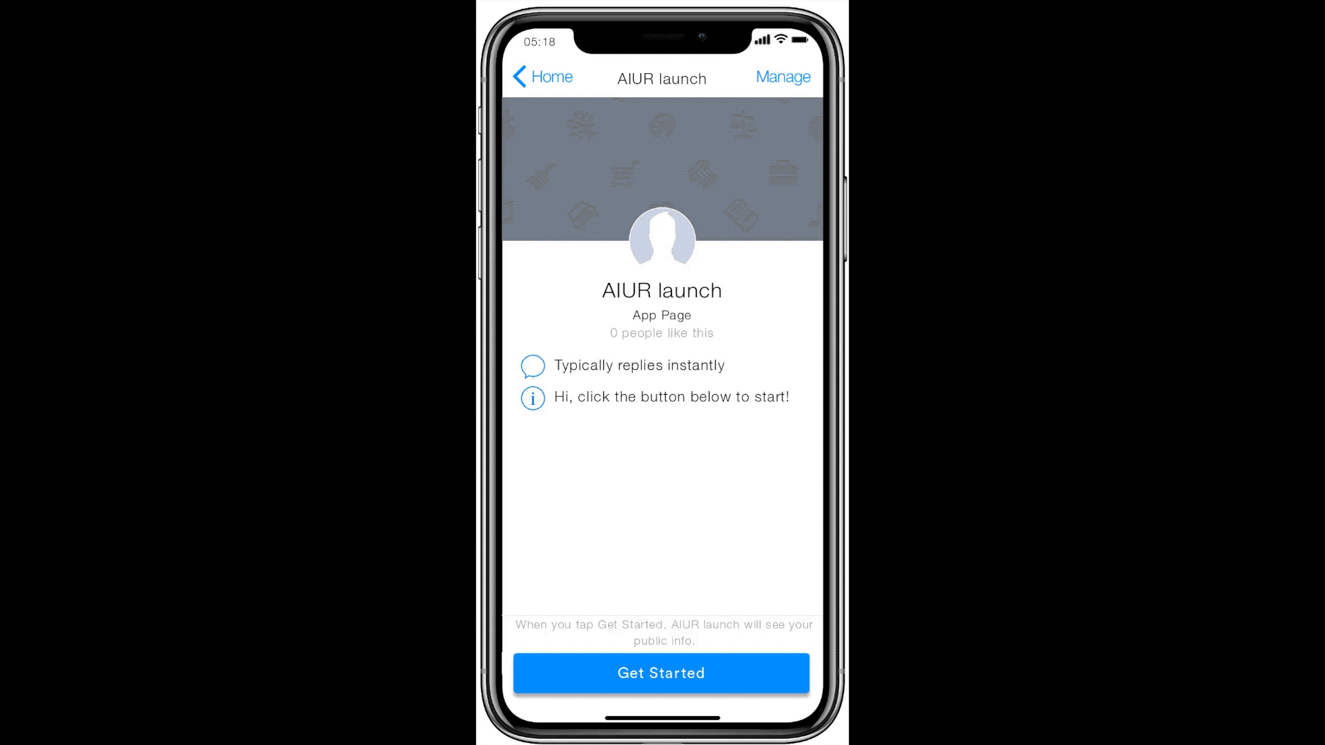
AIUR provides building blocks for any university to organize its large volume of unstructured data and deploy a smart assistant that its students, faculty, and staff can interact with at any time. The minimal viable product of AIUR offers personalized, accurate answers to university constituents’ wide range of questions.
The primary goals of AIUR are to:
Create a product that leverages Natural Language Processing (NLP) and an API platform-as-a-service (PaaS) specifically for the higher education industry.
Simplify the experience that university data providers undergo to securely and easily access and distribute data for university-related projects
Provide self-service options for customers
Provide access to internal university databases
Expose core data to internal users in a controlled manner
Expose selective data to external users in a controlled manner
AIUR: Offering personalized, accurate answers to university constituents

AIUR is a fully compliant PaaS solution providing building blocks for any university to organize its large volume of unstructured data and deploy a smart assistant that its students, faculty, and staff can interact with at any time.
The goal of AIUR is to offer personalized, accurate answers to university constituents’ wide range of questions by leveraging cutting edge machine learning and natural language processing.
What is our product release cycle and MVP?
We went through a planning poker exercise, translated effort into time estimates and developed a release plan.
